








No items found.
from the ground up
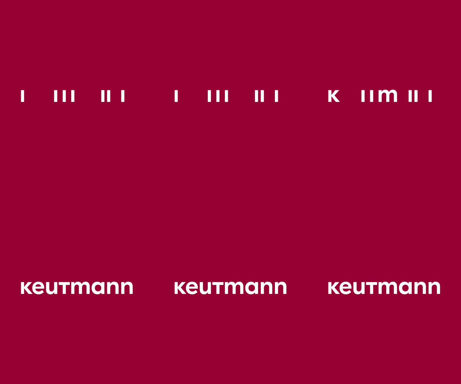
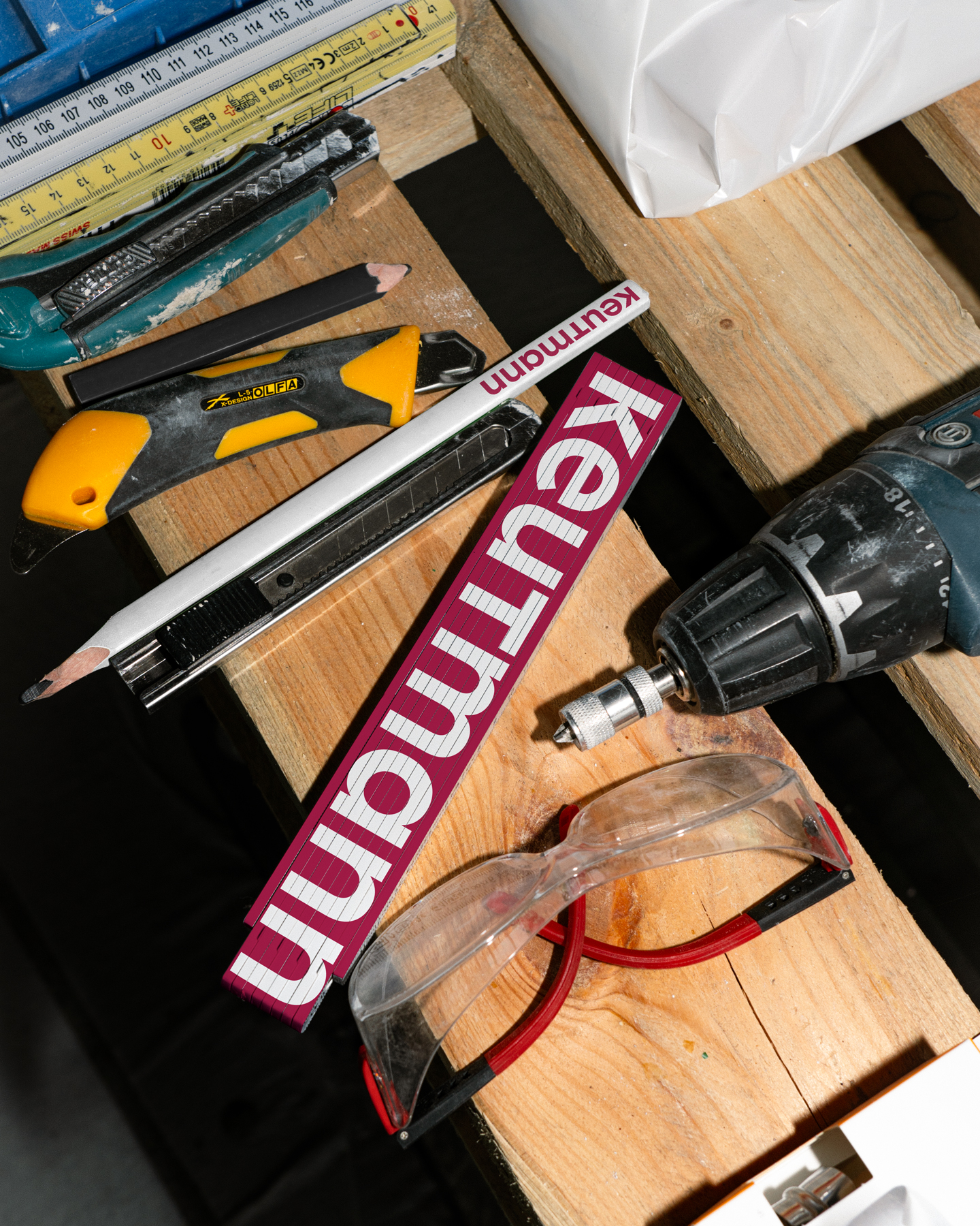
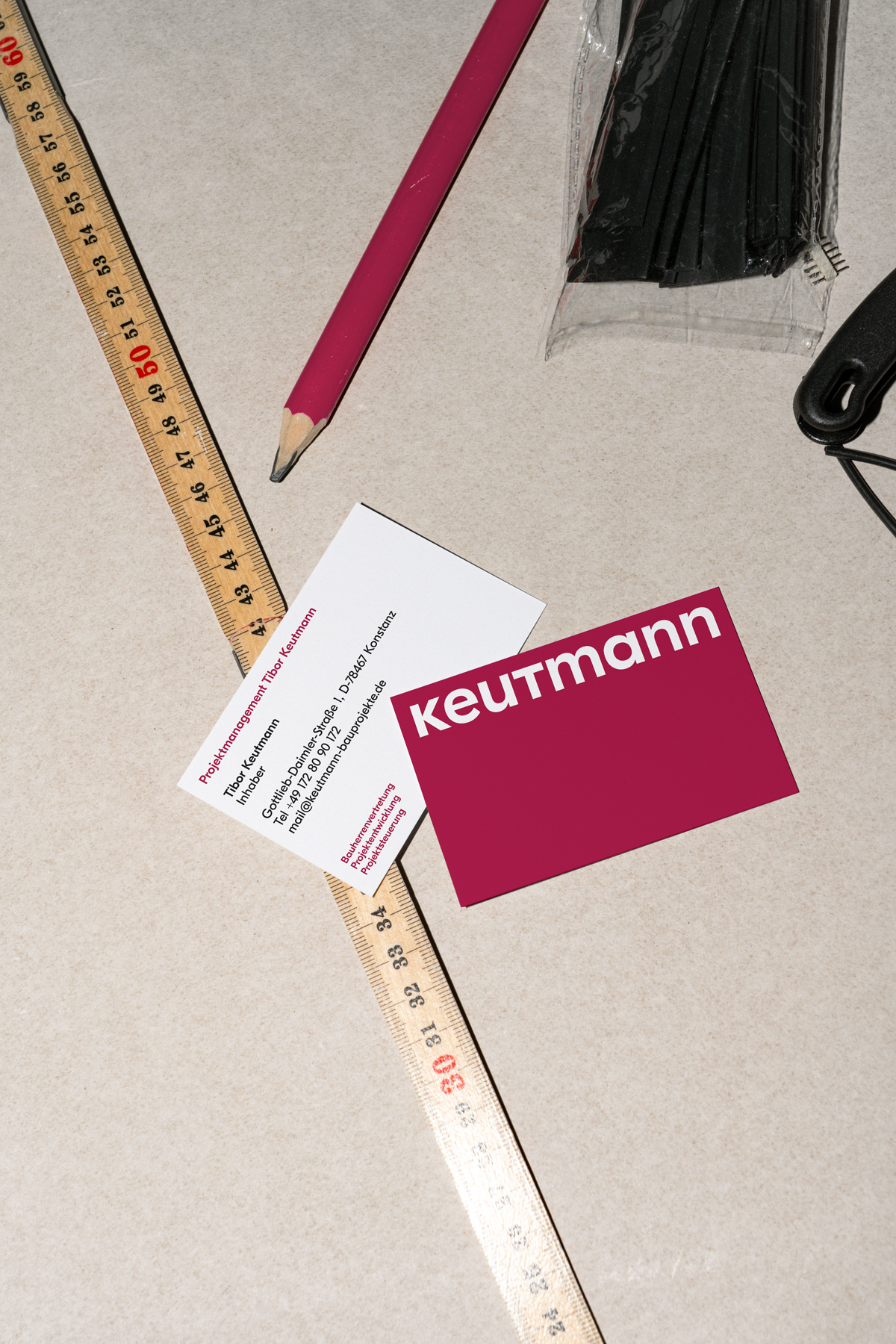
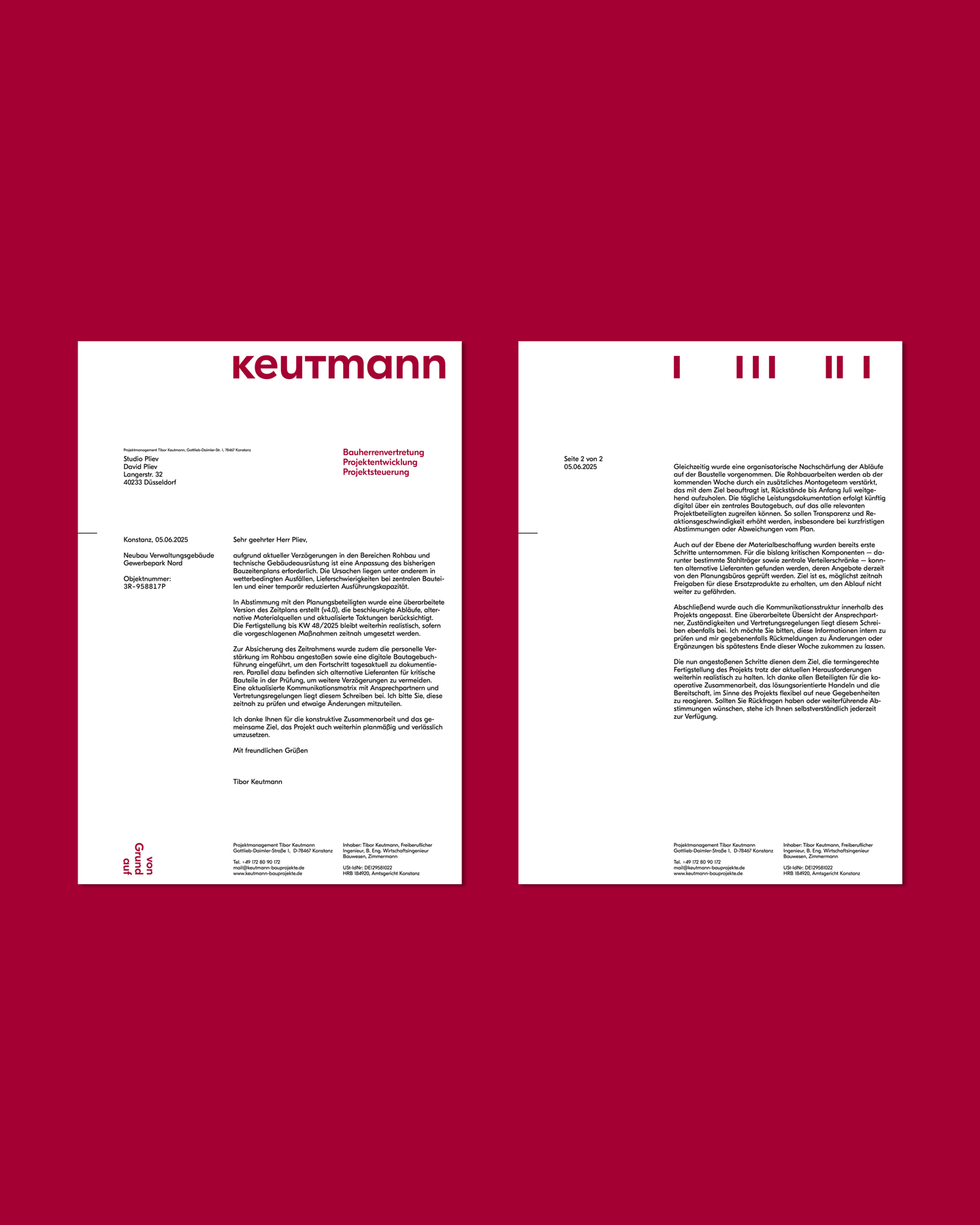
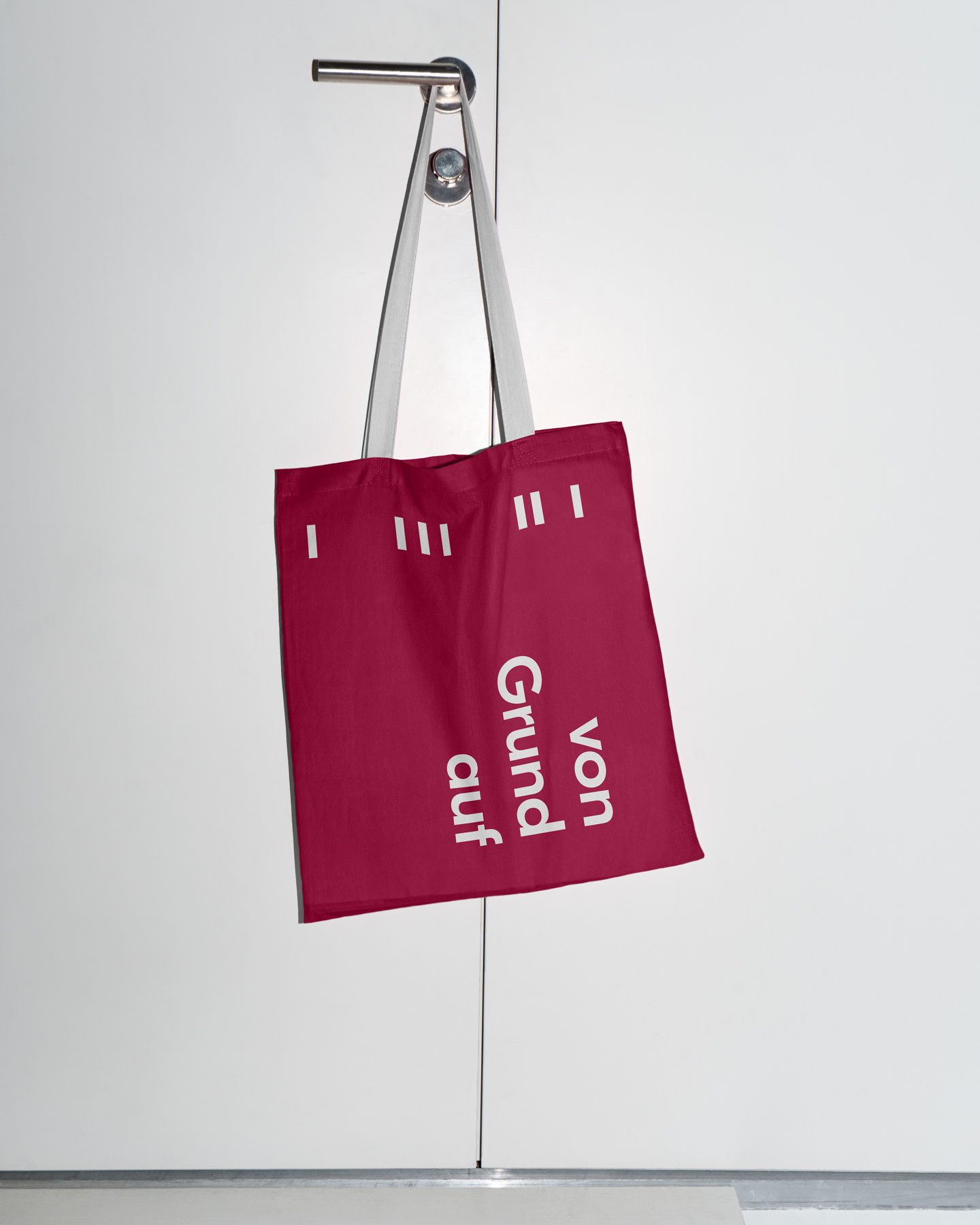
just as a building takes shape step by step, the visual identity of construction representative tibor keutmann follows a clear process. it begins with the raw structure: vertical strokes form the basic framework. next, the first contours emerge as the letters k and m begin to take shape. in the third stage, the construction is complete, the logotype stands. the letters k and t were modified to create a uniform and cohesive structure throughout. the result is a logo that conveys order and resilience. much like a well-planned building.
keutmann
visual identity
konstanz, 2025
client:
projektmanagement tibor keutmann
typeface:
gt eesti display, grilli type
No items found.