






No items found.
oof! ouch! phew ...
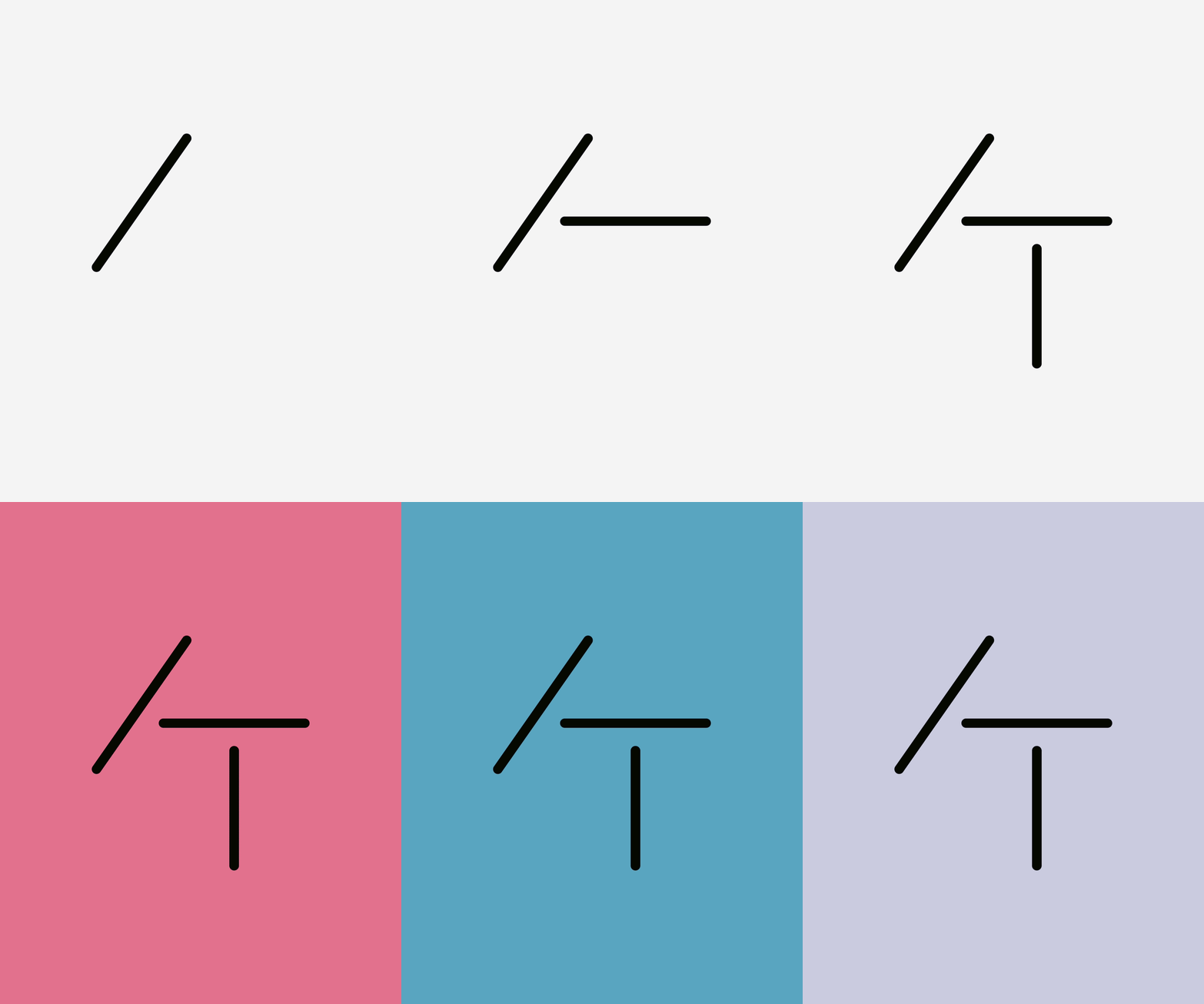
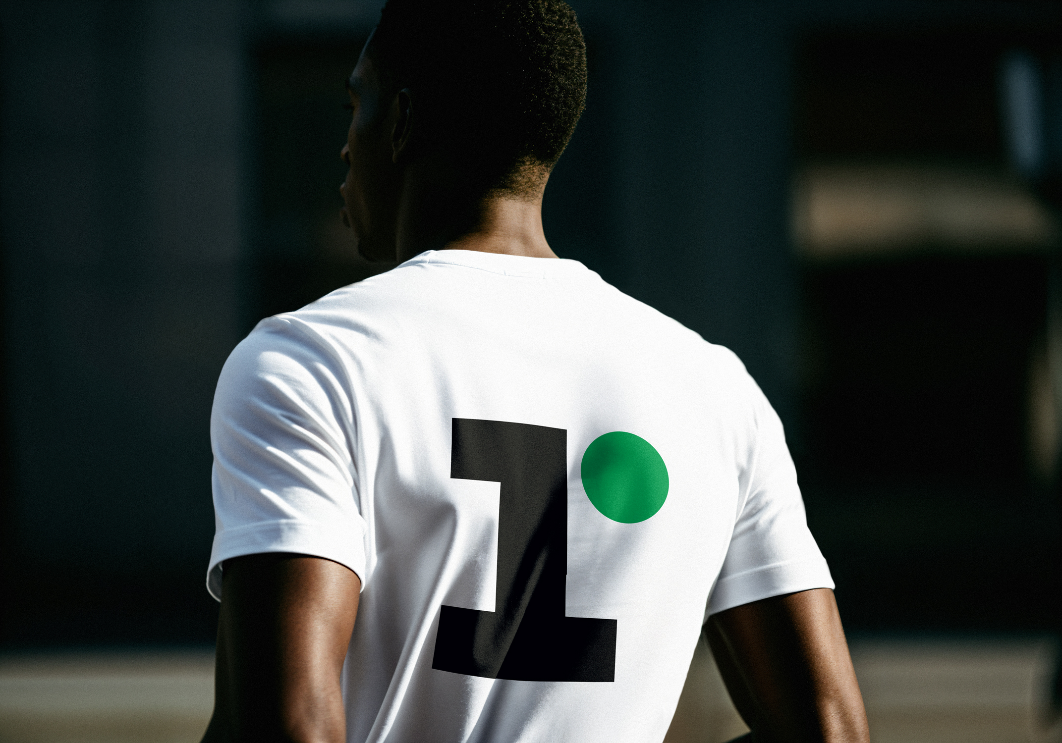
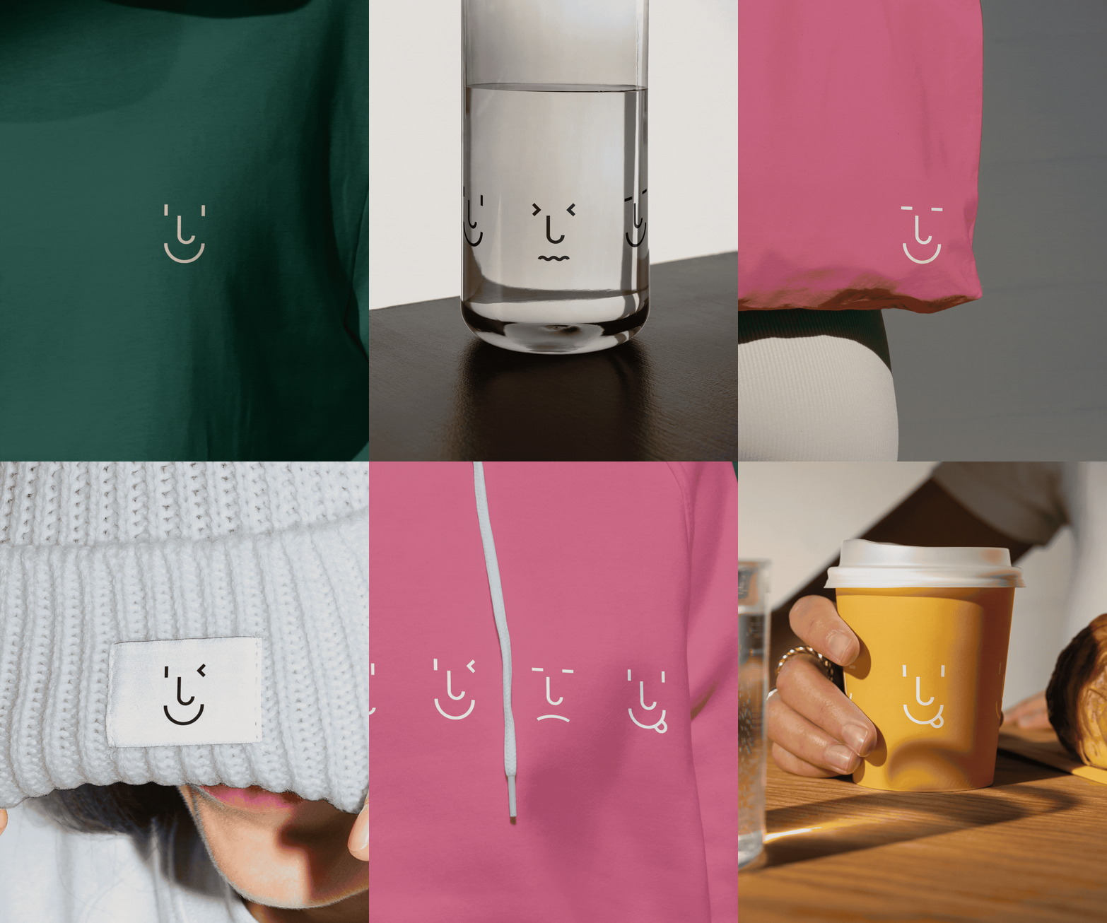
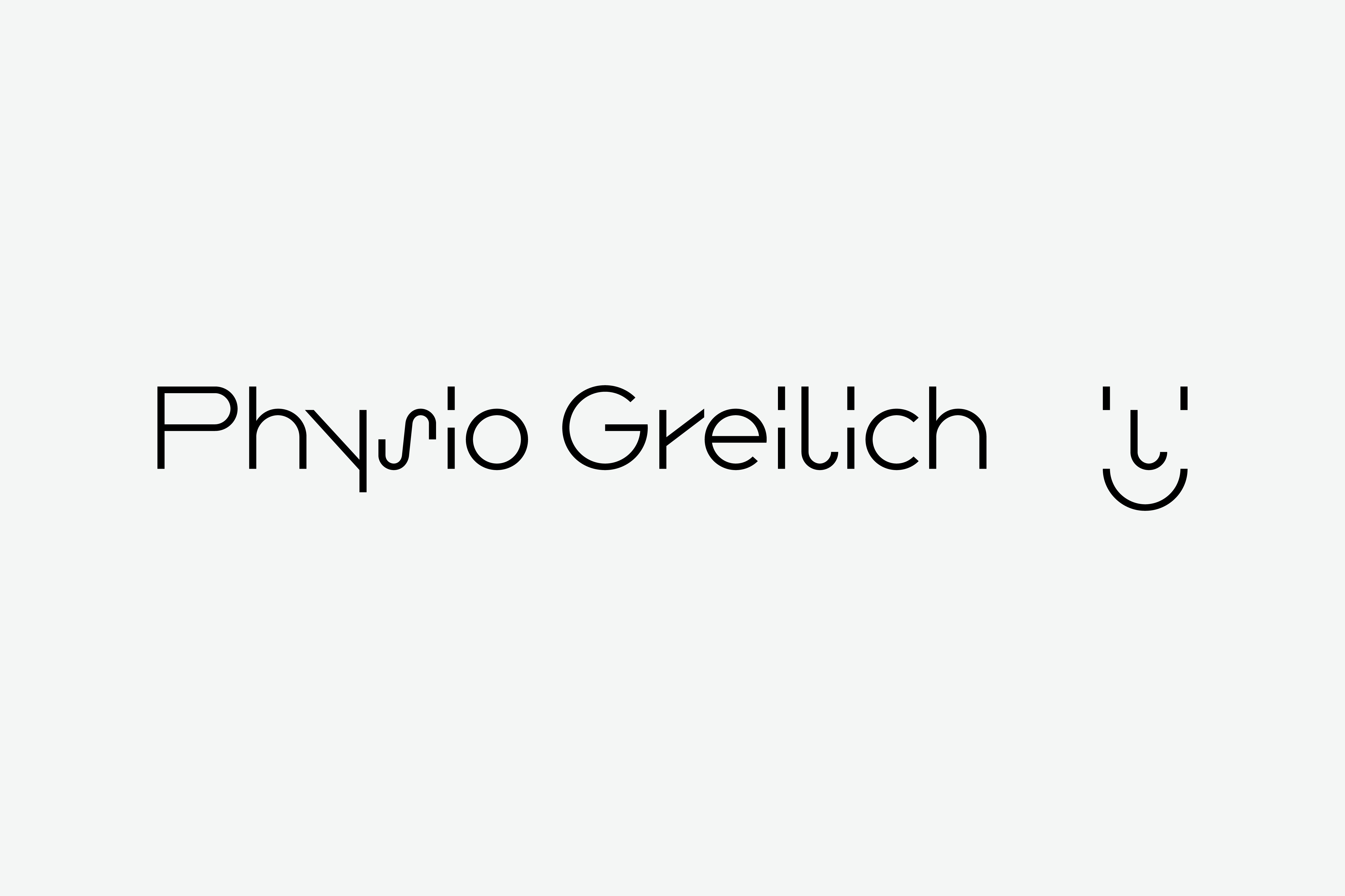
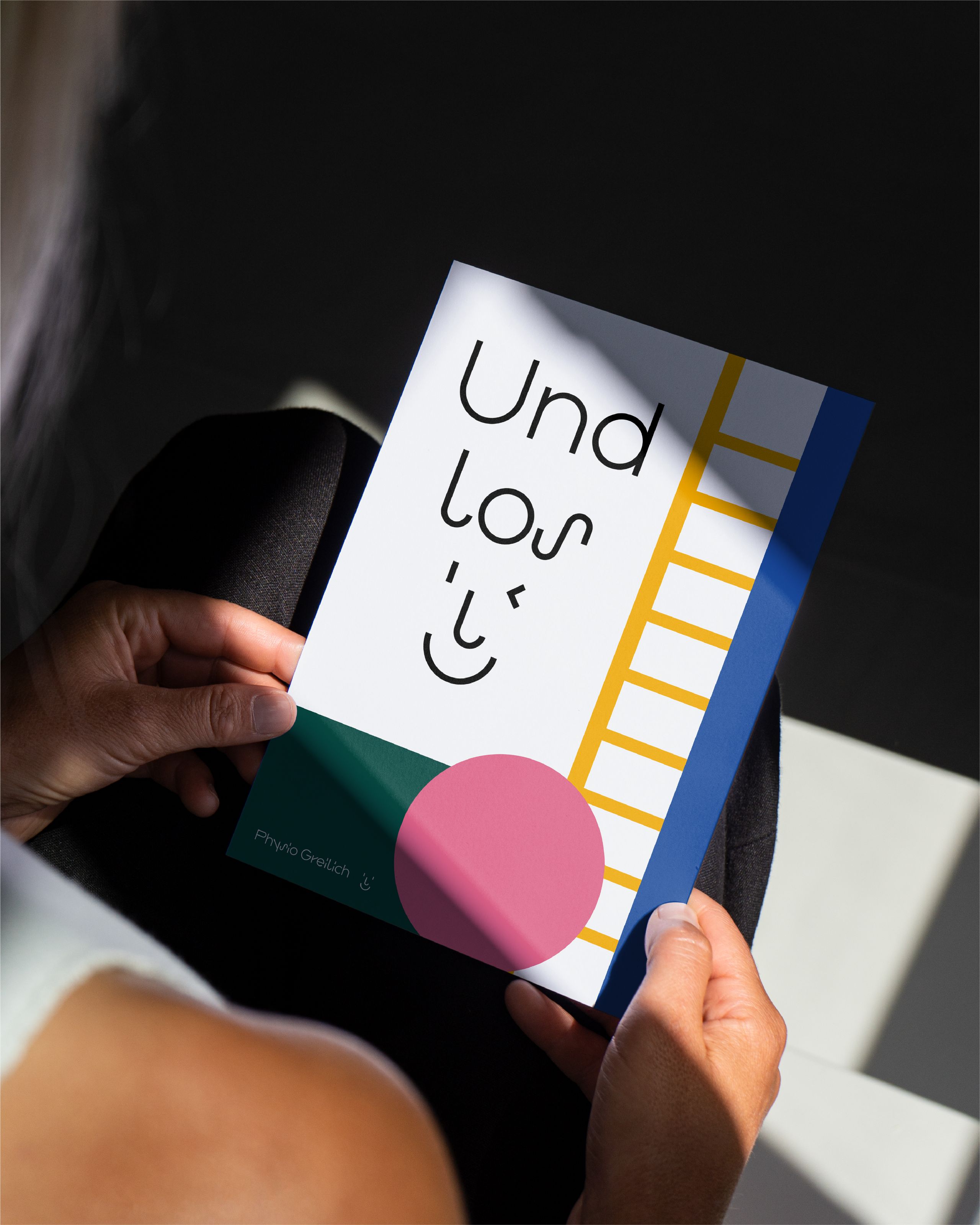
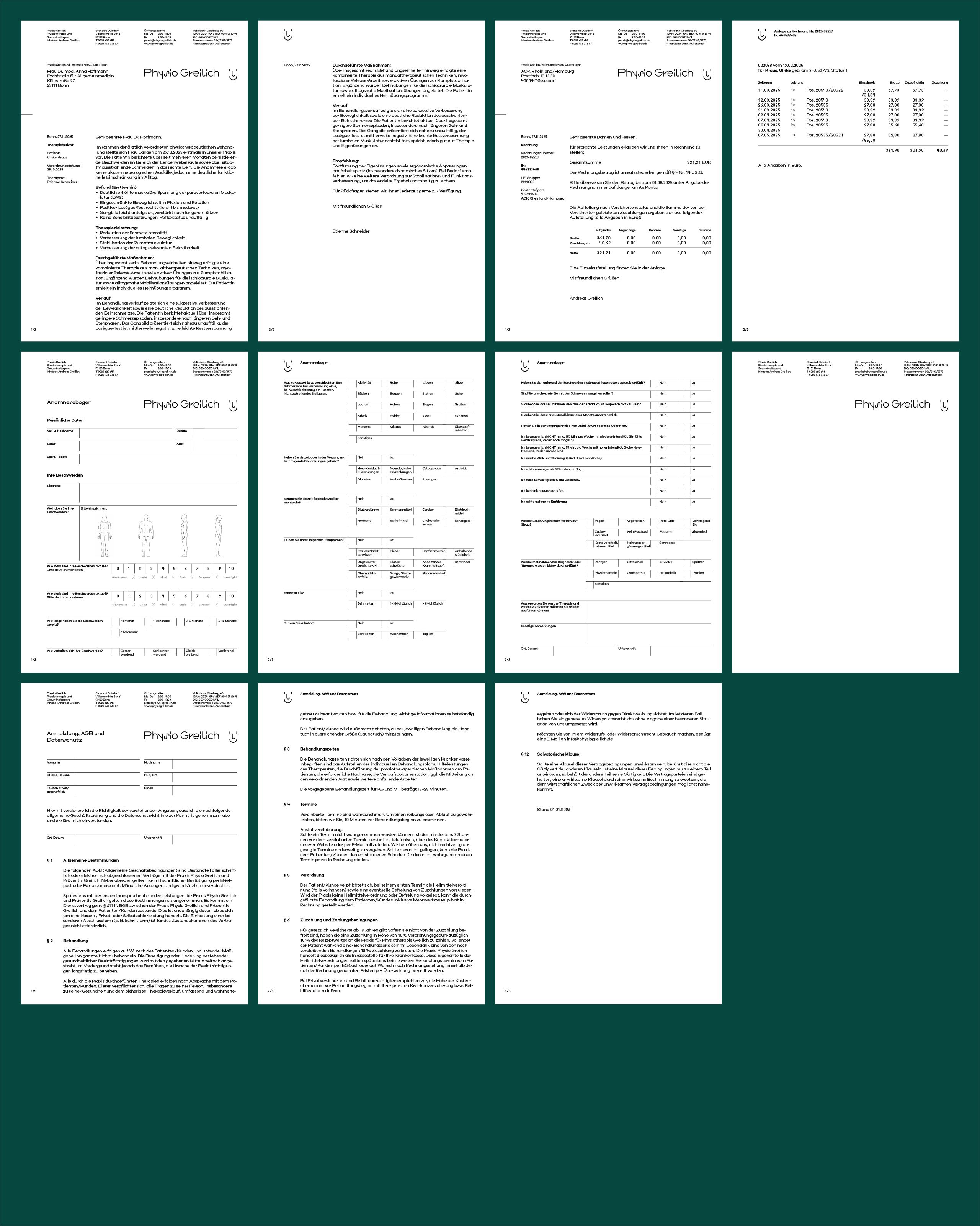
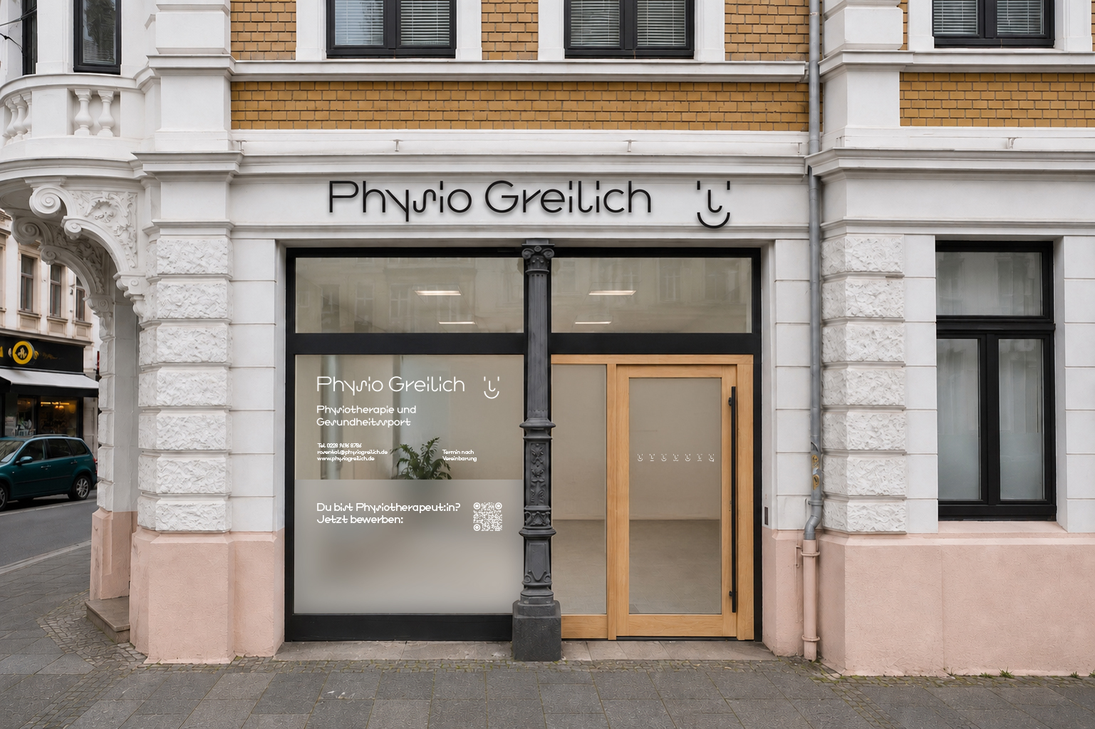
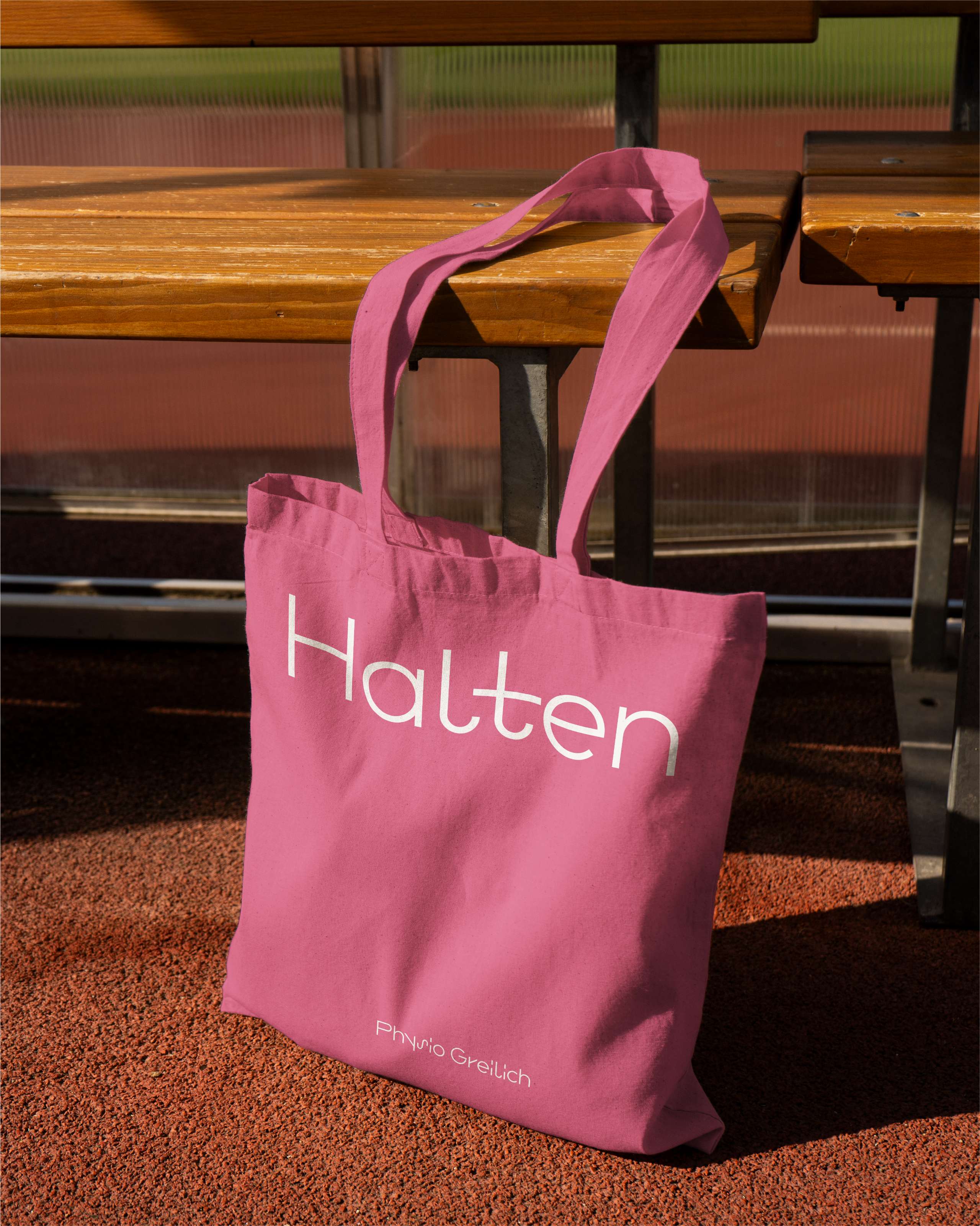
a wide-set typeface with distinctive forms that appears to take on a life of its own sets the tone for physio greilich’s visual identity. based on “neue sammlung” by gabriel richter and yanik hauschild, it was developed into a custom typeface named “physiotype”. for body copy, it was adapted into a calmer text version, sparing readers’ eyes an extra workout. the identity is completed by seven smiley faces that trace the patients’ journey from pain and frustration to renewed mobility. joints aligned, letters set, job done.
physio greilich
visual identity
bonn, 2025
client:
physio greilich
typeface:
physiotype, nicetotype (gabriel richter & yanik hauschild)
No items found.