





No items found.
launch, live, leads
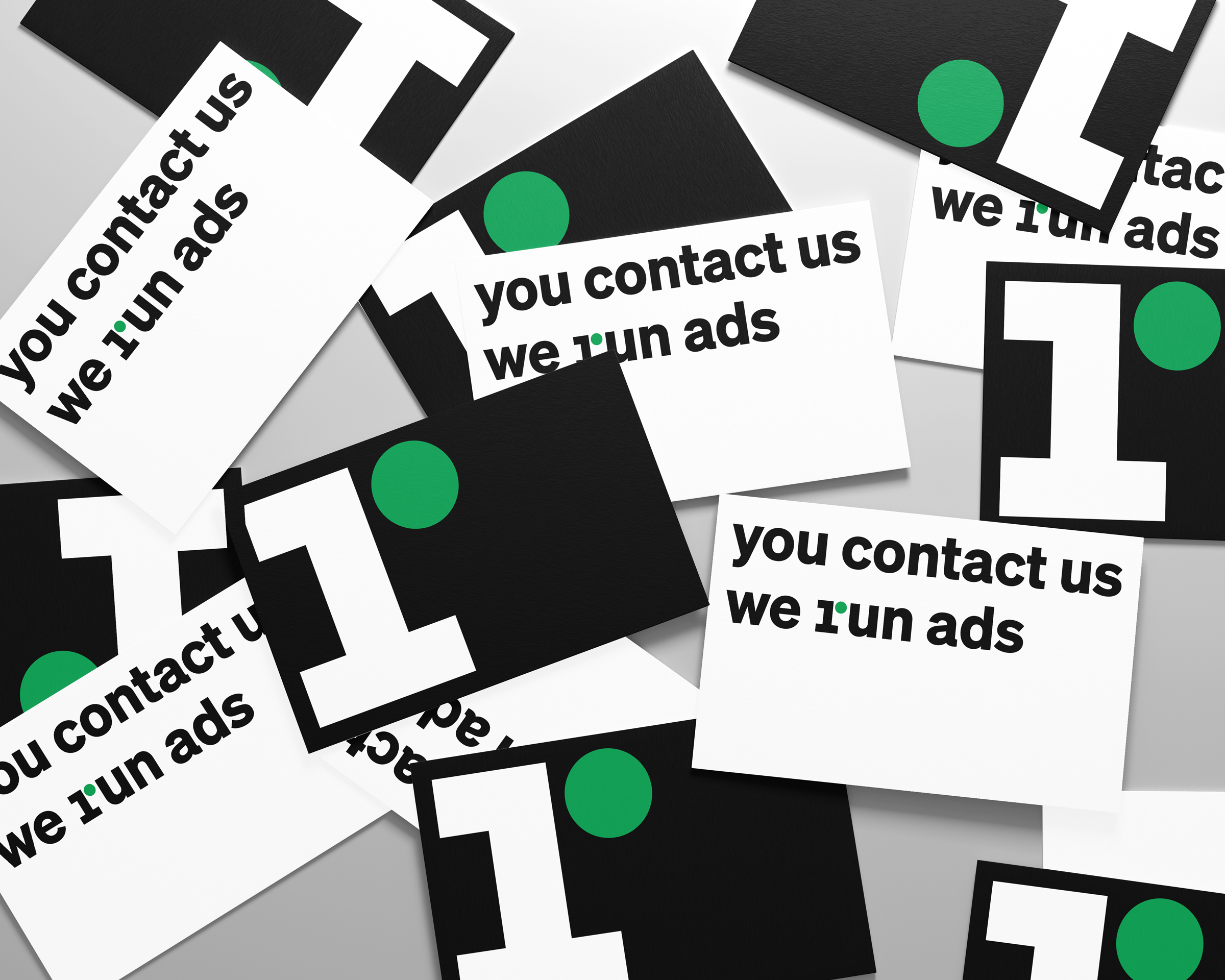
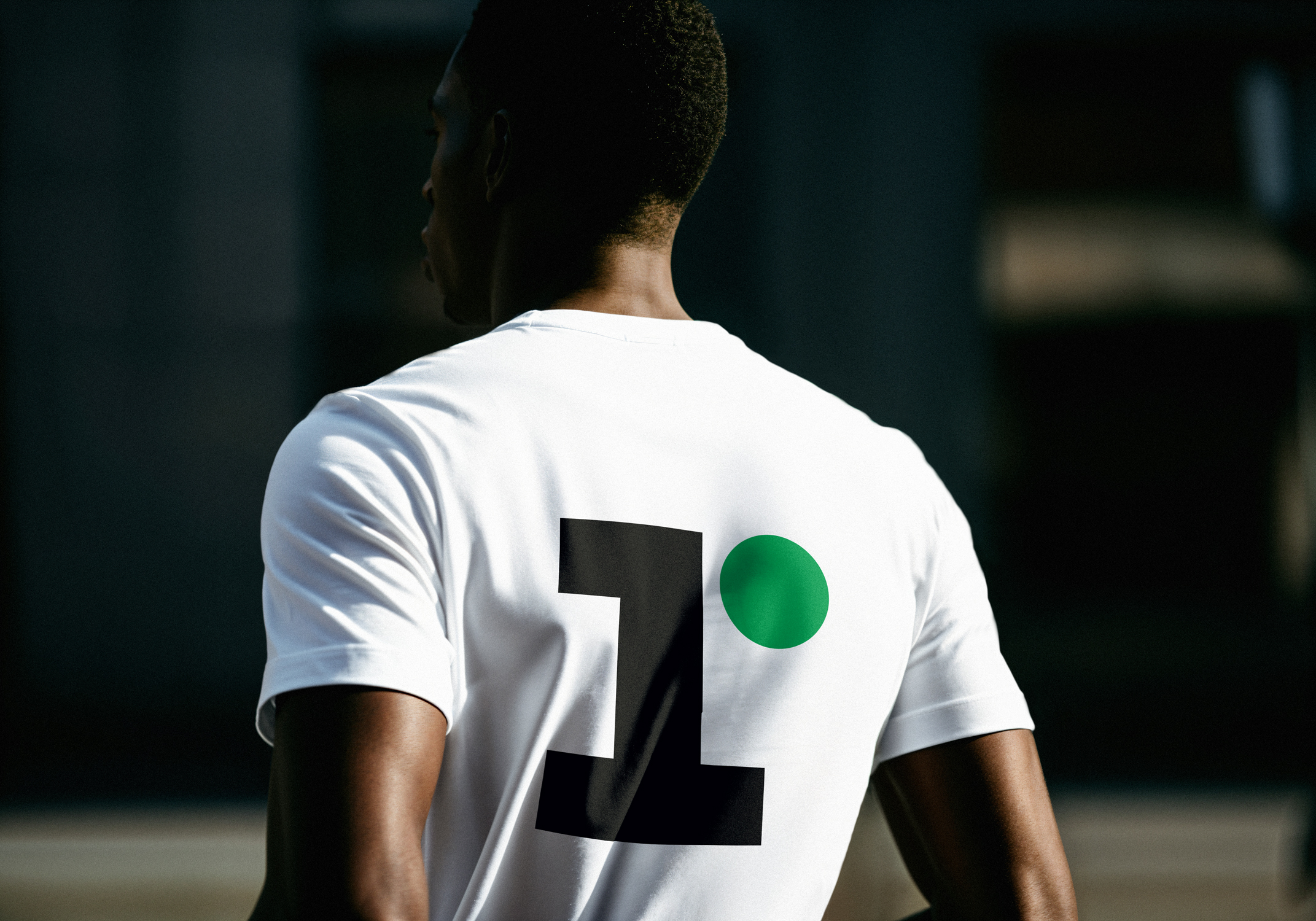
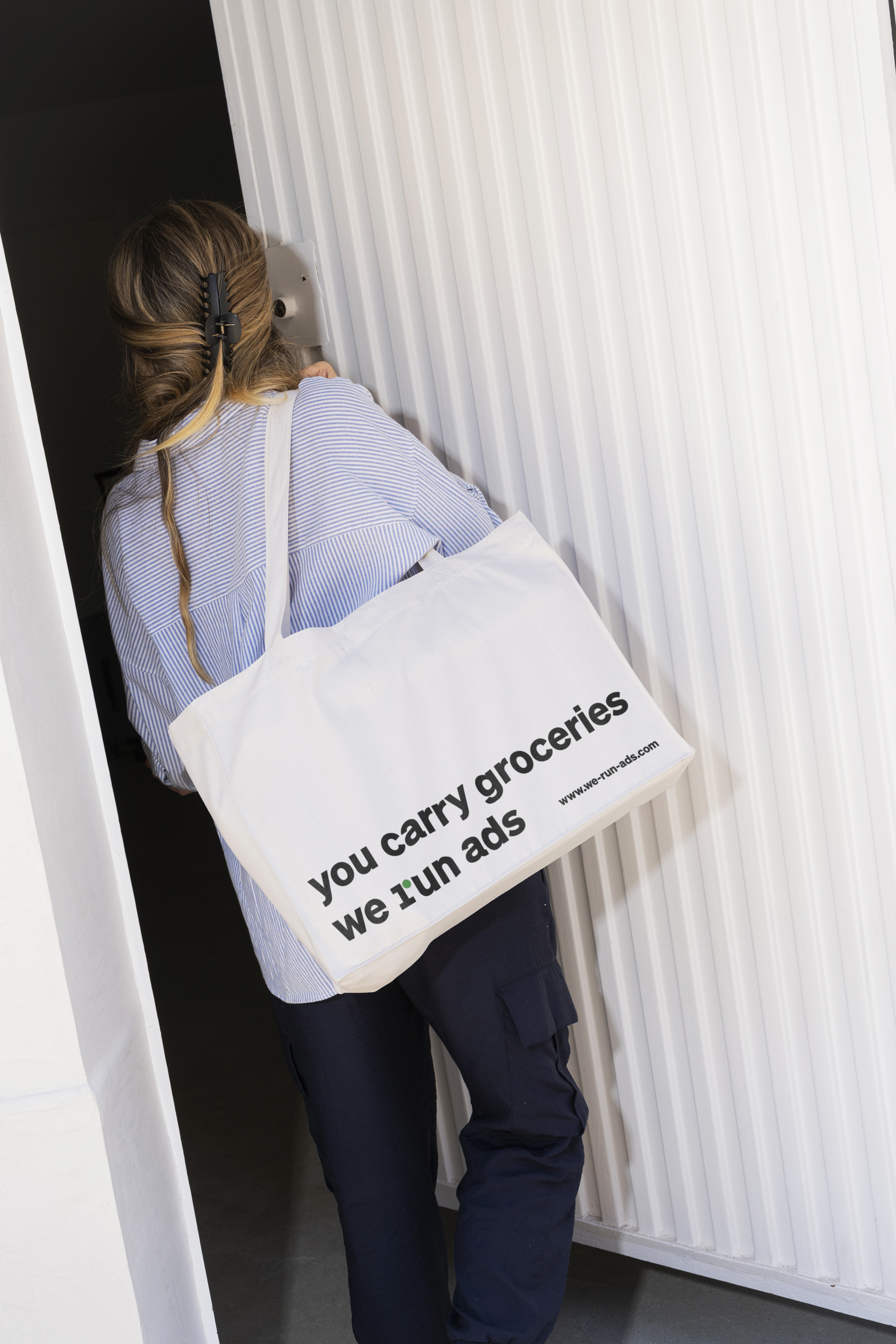
the visual identity of “we run ads”, a marketing agency in leverkusen, communicates what the company is about both visually and linguistically. the name is a complete sentence, reduced to the essentials. so is the design: by embedding a “1” in the “r”, a subtle typographic intervention transforms the name into a wordmark while also forming a lettermark as the company’s smallest communicative unit. the subject-verb-object structure of the name expands into a flexible verbal concept. the agency’s role is clear: running ads. the idea extends to include its clients: “you generate leads, we run ads.” green means go live!
we run ads
visual identity
leverkusen, 2024
client:
dk media gmbh
team:
kristina lambert
david pliev
typeface:
söhne, klim type foundry
No items found.